The worst decorating mistakes and how to fix them – accessories and lighting

The worst decorating mistakes and how to fix them – accessories and lighting
Wow, we made it to part four of this five-part series to discuss the worst decorating mistakes and how to fix them – accessories and lighting. If you’ve stuck around through each part – thank you! I hope the photos and fixes are helping you create rooms you love to live in. So far we’ve covered furniture, wall, and floor mistakes, so now let’s talk about accessories and lighting.

Keep in mind that I have made most, if not all, of these mistakes at some time or another so don’t feel embarrassed or frustrated – these are common and sometimes understandable mistakes. My hope is that you will consider some of the fixes or at least you’ll know what’s been bugging you about the room and you can fix it if you want.

I should also note, that this isn’t a complete list of decorating mistakes, and they’re largely recognized and agreed upon on by the design community – so don’t shoot the messenger. If you have a decorating dilemma or question, please email me directly or leave me a comment below – maybe your question can help others.
The worst decorating mistakes and how to fix them – accessories and lighting
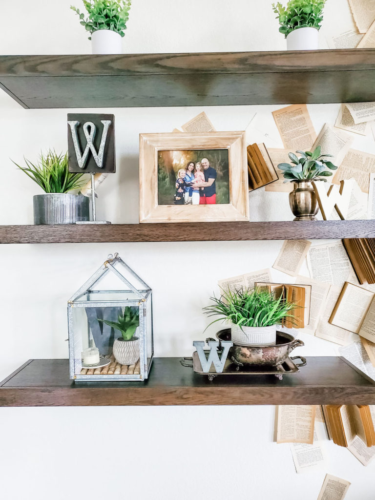
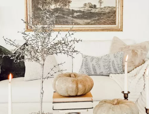
Too many small accessories
Both of my daughters have accumulated large collections of nick-knacks and like most young girls, they put them all out on display. I do worry that this could continue when they become adults. I joke, but one of the worst decorating mistakes is displaying too many small accessories. It becomes clutter, a dust trap, and it just blends in without actually highlighting your style.

To fix this issue, I recommend using plastic bins to store your accessories, and then you can swap them out each season or whenever you want a change of scenery. Displaying a collection together instead of spread out everywhere is another way to change a cluttery scene into an artistic display. It can be hard when you like many items individually, but that doesn’t mean they all look cute together. Remember, for a fresh and timeless look, less is more and contrast is key. Think about how to group a few accessories of varying heights and sizes to decorate tabletops.
No negative space
When a decorated space doesn’t have negative space (empty space) it can feel over-done, cluttered, or unplanned. Not every space has to be filled, nor should it. The one exception is a bookcase, hutch, or picture ledge because these areas are designed for a continuous display. However, minimally styled bookcases are also beautiful, makes a statement, and is artistic.
To fix this hectic eclectic look, start to edit by removing items to create space in between furniture, wall art, and the accessories.

No accessories
A room without any accessories is dull, boring, and lifeless. Kinda like a hotel room.

Decorating your space with accessories adds personality and style to your home. Accessories add visual spots of interest and design, and it’s a mistake if there are no accessories. The beauty behind accessories is that it’s not an all or nothing concept. You can display a few things in a room, things that you enjoy having out, and you can rock a minimalist look.

On the flip side, you can creatively decorate with many accessories in every room of your home – this layered look often has your guests looking up and all around to find your hidden treasures and admiring how you artfully decorated your space. It’s pretty easy to fix the no accessory mistake, just start out with one or two items you like and place them in a room. Move the accessory around until you find where you like it best (side table, coffee table, console, bookcase, media stand, etc.), sometimes setting an accessory on a few books adds even more interest. Accessories add warmth, comfort, and personality to a space – have fun with it.

The rule of 3s
By now, Better Homes and Gardens has taught us all that things look better in odd numbers, particularly groups of three. But it’s a mistake if you only follow this rule of thumb. If everything is grouped in 3s it will look weird and boring. This rule of thumb is a great one, don’t get me wrong, but it can be overdone and taken to the extreme. There is also beauty in pairs, and there’s also a powerful decorating rule of thumb which involves creating visual triangles between accessories.

To fix the obsession of only grouping accessories in 3s is easy – remove an item and leave a tall and short item side by side. Don’t undo all your groupings of three items, but look for areas that the grouping can be converted into a triangle. For instance, if you have a grouping of three items at one end of a console, trying moving the medium-height object to the other side for a balanced look. This will leave three items on the console, but creates a larger triangle connection between the objects at each end of the table.

Getting stuck with symmetry
I may be reaching if I say that decorating with everything symmetrical is one of the worst mistakes, but it is a mistake. The same can be said if everything is asymmetrically situated. Hear me out, and then make up your own mind. For fresh and timeless design, it’s best to have a mix of symmetry and asymmetry. Symmetrical designs infuse order and balance into a home. And asymmetry adds flexibility and flow into a home. Both decorating styles add elements to your home that create an inviting and comfortable space.

You can prefer symmetrical design in your home, but if you create just one asymmetrical spot, you will love how it strengthens the entire design of your home – it will add variety and interest. If you’re not sure where you fall in this particular mistake, just take a tour of your home and note how you hang wall art, how you style shelving and tabletops, and arrange furniture. You should be able to spot if a space is totally symmetrical or totally asymmetrical.

If an entire room is totally one way, find a spot to update with the other design method. If asymmetrical design severely bugs you, try removing some of the symmetrical design so that it’s not so heavy. You can also start with something small like having two throw pillows at one end of your sofa and just one pillow at the other end. At the end of the day, what matters most is that it’s your space and you should feel comfortable and peaceful within it regardless of best design practices.
No plants
Have you ever noticed that a room with plants (real or faux) just feels better? Plants add life, texture, comfort, dimension, and color. A room design without plants is one of the worst decorating mistakes. If you don’t have a green thumb or enough light to sustain plants, I encourage you to consider faux plants. There are so many faux options these days, they’re affordable, and the planters can coordinate with so many décor styles. Faux succulents are one of my favorites because their smaller size looks great in small spaces or just to add a spot of color.

You may also be interested in: Easy ways to decorate with plants
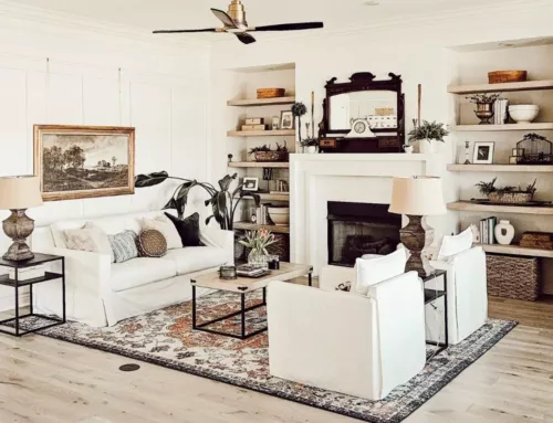
Awesome accessories for a fresh and timeless style

The worst lighting mistakes
Harsh lighting
It wasn’t that long ago that LED lighting became the standard and everyone ran out and replaced their lights with these ‘forever lights’. And then everyone started talking about hating these blue lights, they were too harsh and driving everyone crazy. Manufacturers listened and created warmer colors of LED lights and various colors for all the various preferences. We sure live in the land of choices, don’t we!
While I’m all for energy saving bulbs that don’t need to be replaced all the time and create more waste, I’m also a fan of warm toned lights for my home. Lighting is a very important part of a space and you want to make sure a space isn’t overly bright, like a surgical room, or too dim. Most of the time, the right bulb can fix this issue.

Not enough light
Most rooms don’t have enough light, at least throughout all the different periods of the day. There is some psychology wrapped up with lighting and while I won’t get into that (because I’m not a psychologist) it’s important to note that a lack of lighting does affect some of us more than others. Dim light can also tire your eyes, so it can be healthier in many ways to invest in a little more lighting – it’s not just for good design.

Designers recommend having at least three lighting sources for ambient and task lighting purposes. If you only have overhead lighting in a room it can feel cold and clinical. By adding some ambient light you will create a much cozier feel to the space. You can layer lighting in the room to make sure there’s adequate lighting throughout the day/night. You’ll want to consider having lights at different heights and at varying intensities. A lot of homeowners have opted for light dimmers and wall sconces to help create a softer cozier feel.

Chandelier size
If a chandelier is too big or too small for a space, it can look off. Be sure to select lighting that is proportionate to the size of the room or table.

An easy way to determine the correct diameter to use is to add the length (in feet) and width (in feet) of a the room – this total will be how many inches wide the chandelier should be. If my dining room is 14’ by 20’ (34’), then the diameter of my chandelier should be 34 inches. If the room isn’t easily defined, like in a kitchen nook, you can fit the light for the size of the table. A chandelier should be approximately ½ to 2/3 the width of the table. If my kitchen nook table is four feet long, a chandelier that’s 24”-32” wide will look proportionate to the table.

The Lighting Connection has this awesome info-graphic to help you correctly position lighting all throughout your home.

You can look forward to even more decorating mistakes coming up. In this series I cover; furniture, walls, floors, lighting and accessories, and design planning. Planning out your design not only saves you a headache, but it can usually save you money as well. If the thought of coordinating pieces to create a style, as well as selecting all the pieces to fit your budget stresses you out, you may consider 804 Sycamore E-design.
My clients take a short online design survey, chat on the phone with me, measure their room, snap a few photos of the room, and then sit back while I work on a design. Clients will receive:
- A final design board (up to 3 rounds of changes are included)
- A list of items and links to purchase at your convenience
- A room layout design to set it up like a pro
- Detailed instructions for all the finishing touches within the space
- Communication with me throughout the process

E-design is easily the most affordable option to get professional design help. 804 Sycamore specializes in fresh and timeless design to create a welcoming modern farmhouse. If your style is antique Victorian, then I’m probably not the best fit. If you’re signed up to receive my weekly email, you will get the coupon code for $50 off any E-design package.
Decorating mistakes series
- Worst furniture mistakes – part 1
- Worst wall mistakes – part 2
- Worst floor mistakes – part 3
- Worst design planning mistakes – part 5
Thank you so much for reading the worst decorating mistakes and how to fix them – accessories and lighting! I hope it was helpful and inspiring. We all make mistakes now and then, and we’re all learning – I hope you’re feeling motivated with ideas on some ways to fix your decorating mistake so that you feel confident about your room design and layout.

POSTED IN: Decorating
Let's be friends!
Related Posts
Search
Categories
Subscribe
Get the latest posts, discounts, and design inspiration right to your inbox.
