The worst decorating mistakes and how to fix them – walls

The worst decorating mistakes and how to fix them – walls
This post is part two of a five-part series to highlight the worst decorating mistakes and how to fix them – walls. If you missed part one about furniture mistakes, check it out here. This post will cover the worst decorating mistakes on the wall.
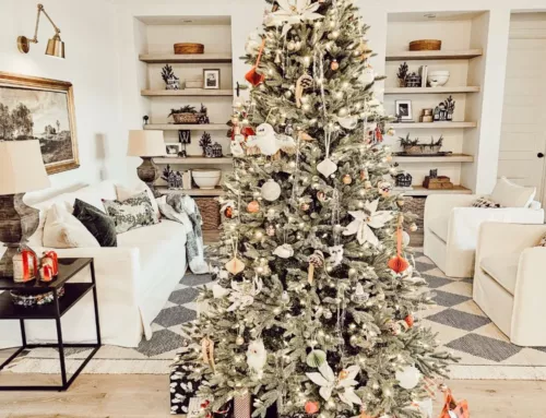
(The main image for this post The worst decorating mistakes and how to fix them – walls, is from the Poster Store.)

Have you ever walked into a home or place of business and immediately noticed that there was something off with the wall art? Or maybe you knew exactly what was wrong and wished you could just fix it. I believe that if someone knows the decorating rules of thumb for hanging art on the wall or the aesthetic guidelines, they will apply them in their own home. Some people just have a sense about it, while others know the exact suggested space (in inches) that should go between artwork or at what height to hang a large focal piece.
However, if you aren’t familiar with these guidelines and have always just hung stuff up, then this post is for you! And I’m so glad you’re here because correctly displayed artwork is one of the most important layers to a good room design. If everything in a room is done ‘right’ and the walls are off — yikes, the walls can spoil it for the entire design.

You may be interested in:
I had a hard time finding photos of bad wall decorating examples (although I know they exist), so I’m going to use some illustrations to give a few examples of what’s wrong and how to fix it. I have also included some beautiful examples of wall art hung correctly – I hope they provide inspiration and ideas for your home!
The worst decorating mistakes and how to fix them – walls
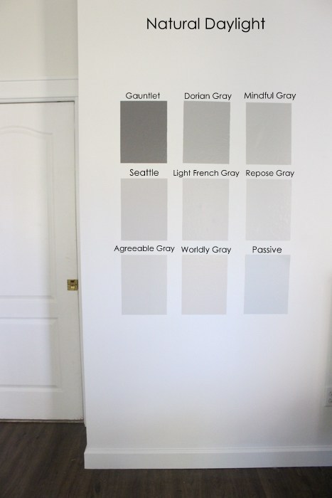
Paint colors look different in individual homes, on a little swatch, and in different lighting. It’s a pain to test colors first and it cost money, but it cost more to paint over a color that doesn’t turn out. Even if you love a color in someone else’s home, you’ll still want to test it on your wall, with your lighting, and in your space. Sherwin Williams has very affordable test paint samples for the purpose of testing a small patch on your wall. I recommend painting a 12×12 inch patch in a naturally lit space as well as a darker space in the room. Once all your test shades are painted and dry, live with the color for a while and check it out throughout the day. You’ll notice very quickly which shades have yellow, red, blue, and green undertones.

It’s also a mistake to paint the walls before you’ve selected the other furnishings (sofa, chairs, rug etc.). A paint color can limit you into selecting furnishings that you don’t love. If possible, select your paint color last so that it can play off the furnishings and complement the design.
An accent wall should have purpose, and not be done because you’re scared to add color to all four walls. Accent colors often work well in alcoves, the wall behind a TV, behind built-ins, a stairway, behind the bed, and on a paneled wall, to name a few. If you want to paint walls a darker, brighter, or bolder shade, be sure to paint test patches as discussed above.

Correctly hanging wall art is one of my favorite parts of decorating! Wall art feels like the frosting to a well-baked room design. The worst wall art mistakes are:
- Hanging art too high
- Spacing pieces apart too much
- Not anchoring art
- Not hanging the correct sized art for the size of wall it’s on.

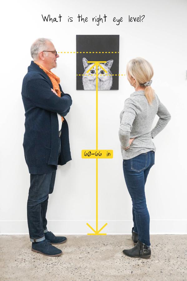
The right height for a piece varies some because it depends a little on your ceiling height, the size of the wall art, and if it’s a part of a grouping or not. But a general rule of thumb is to hang a single piece of wall art at 60-66 inches from the floor. Both positions are comfortable for shorter and taller people alike. I tend to hang pieces at 60 inches or a bit lower. Some people just eye it and never measure. You’ll know it’s too high if you’re looking up at a piece.
When wall art is spaced apart too much, it causes the grouping to look disconnected and has a floating effect. Small wall art especially needs to be connected to other pieces and not spaced apart too much. My general rule of thumb is to hang wall art no farther than two inches from another piece in the grouping.

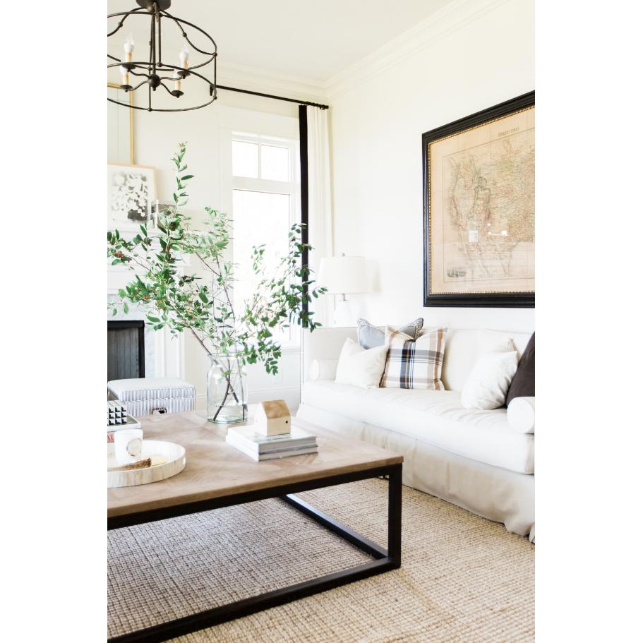
Wall art that isn’t anchored to a piece of furniture or that’s too small to fill up a wall space is usually a mistake, but it’s an easy fix. To anchor wall art, hang the art above the sofa or console table with no more than 8-10 inches between the top of the furniture and the bottom of the art. This way the art will feel close enough to the ensemble, but you won’t bump it when sitting on the sofa. I like to go as close as 6 inches apart from a console table — as long as the art is large enough to fill the upper space.

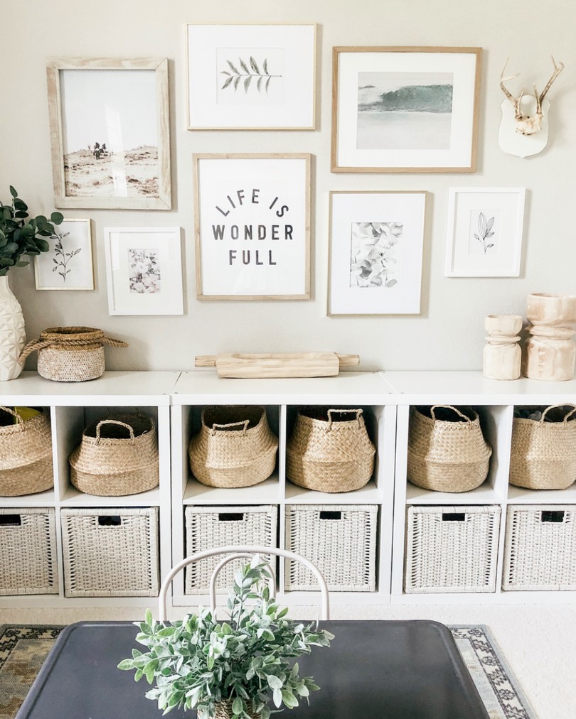
If you have a blank wall and no furniture to anchor the wall art, it’s best to arrange a grouping or gallery. The size of the wall and your particular preference will help determine which one to do. A small wall should either be left blank or group 2-3 smaller frames vertically to create the illusion of one piece – this is the specific style for homes with a fresh and timeless design.

A large wall could be considered for a symmetrical gallery or a large asymmetrical grouping. Picture ledges are also a great option for creating gallery walls (with mismatched frames – the linear line of the ledge gives the grouping a consistency and visual balance regardless of the frame color and size.). I prefer larger wall art over several small pieces, but if you can coordinate the frame color(s) for groupings it will look even more artful and connected.
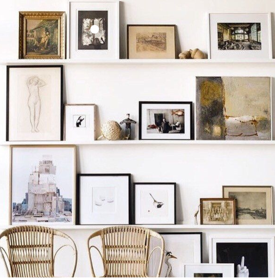
Having too many photo frames on tabletops can get create a cluttered look that causes all your beautiful photos to just blend into the background. However, not having any photos on tabletops isn’t the only option. A gallery wall or photo ledge is my favorite way to show off treasured family photos, but setting a few special photo frames on a desk, shelf, or console table can create a cozy, casual, and comfortable vibe.
With just a few strategically placed tabletop frames around your home, they will be noticed and highlighted. And if you have a lot of photos that you like to see and display, consider using a cork board, magnet board, or pin board to collect your treasures in one space – this helps keep the clutter down and your keepsakes displayed proudly for you to enjoy.

If you’ve made any of these wall art mistakes, don’t feel embarrassed or frustrated – these are common and sometimes understandable mistakes. Most of these wall decorating mistakes are made because you just didn’t know, you didn’t care, you couldn’t afford to change it, or maybe you liked it regardless of decorating rules-of-thumb. If you identify one of these mistakes in your home, but prefer it they way it is – you should absolutely keep it as is. It’s your home, your style, and things should look the way you want.

Although, my hope is that after reading this post, if you identify any of the worst decorating mistakes on your walls, that you will be open to considering some of the fixes or at least you’ll have an understanding of why you can’t get your room to look or feel a certain way (maybe it’s because the wall decor is too high~).

The purpose of this post is to help you achieve your decorating goals, layer by layer. There’s no need to read all five parts of this series before taking action. Each part is independent from the others and design is done in layers, so just address one layer at a time.
804 Sycamore E-design
You can look forward to even more decorating mistakes coming up. In this series I cover; furniture, walls, floors, lighting and accessories, and design planning. Planning out your design can not only save you a headache, but it can usually save you money as well. If you struggle with planning the overall design, the big picture, as well as selecting all the pieces to fit your budget, you may consider 804 Sycamore E-design.
My clients take a short online design survey, chat on the phone with me, measure their room, snap a few photos of the room, and then sit back while I work on a design. Clients will receive:
- A final design board (up to 3 design board changes are included)
- A list of items and links to purchase at your convenience
- A room layout design
- Detailed instructions to put all the finishing touches on the room
- Communication with me as questions come up or to request a different option for the design board
E-design is easily the most affordable option to get professional design help. If your style is antique Victorian, then I’m probably not the best fit. 804 Sycamore specializes in fresh and timeless design to create a welcoming modern farmhouse. If you’re signed up to receive my weekly email, you will get the coupon code for $100 off any E-design package.
Decorating mistakes series
- Worst furniture mistakes
- Worst floor mistakes
- Worst lighting and accessories mistakes
- Worst design planning mistakes
Thanks so much for checking out this post. I hope it was helpful and encouraging. We all make mistakes now and then, and we’re all learning – I hope you’re energized with some ways to fix your decorating mistake so that you feel confident about your room design and layout.

POSTED IN: Decorating
Let's be friends!
Related Posts
Search
Categories
Subscribe
Get the latest posts, discounts, and design inspiration right to your inbox.
